


[Case 02]
I-VLE: Redesigning the Student Learning Hub
Education

I-VLE: Redesigning the Student Learning Hub
Reducing tool-switching by bringing projects, chat, and feedback into one platform.
[Project Overview]
I-VLE (Innovative Virtual Learning Environment) is a concept VLE designed to improve how students learn and collaborate online for the University of London Southbank. The goal was to modernise the experience and keep everything needed for coursework, projects, communication, and feedback in one place.
[Challenge]
Students often rely on external tools (WhatsApp, Discord, Teams) for group work, which creates [[ distractions and scattered information. ]] The existing LSBU VLE also feels outdated, offers limited group feedback tools, and can [[fall short on accessibility and clarity. ]]
[Industry]
Education
[My Role]
UI/UX Designer
[Platforms]
Desktop
[Timeline]
3 Months
[Persona]

Ivan Evander
Artificial Intelligence Module Leader
"As a teacher, I want clear feedback and visibility into student progress"
Age: 32
Location: London
Education: MSc in Computer Science
Gender: Male
[Goal]
Get a clear overview of student activity, grades, and attendence.
Provide structured, timely feedback without switching tools.
Communicate efficiently with students in the VLE platform.
[Frustrations]
No summarised view of student progress across modules.
Limitations in providing detailed feedback through the VLE platform.
Limited visibility into student engagement outside class hours.
[Action Taken]
[01] Ideation & Prioritisation
Based on interviews with both students and teachers, I generated a broad set of ideas to address key issues in the current VLE, especially around feedback clarity, collaboration, and accessibility. I then [[ clustered these ideas into themes ]] (e.g. accessibility, project management, communication, module management, and personalised experience) to help [[ evaluate impact and identify the strongest feature to take forward ]] into design.
[02] Low-Fidelity Wireframing
I translated these key ideas into low-fidelity wireframes to [[ explore structure, layout, and core interactions. ]] I created [[separate flows for teachers and students ]] to reflect their different goals and responsibilities. This helped [[ validate early assumptions]], align the design with user needs, and set solid foundation before moving into higher-fidelity design.
[03] Typography & Colour Palette
Roboto was chosen for its [[ clean, modern feels and flexible range of weights]], making it easy to create clear hierarchy across headings, body text, and UI labels. The colour pallete is based on [[ LSBU's existing brand colours]], helping the redesign feel similar to students while still supporting accessible states like success, warning, and error.
[04] High-Fidelity Design
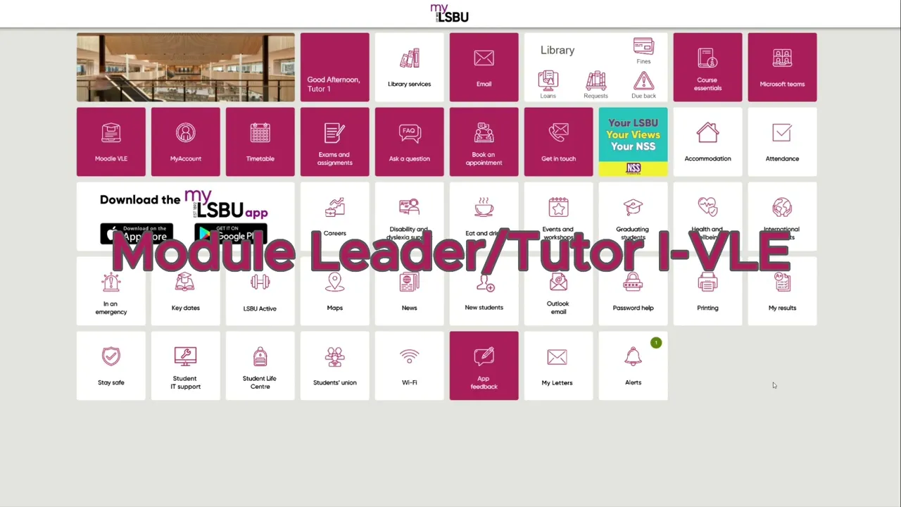
The concepts were then translated into high-fidelity interface designs for both students and module leaders, focusing on [[ clarity, hierarchy, and consistency ]] across the platform. Core screens such as course, dashboards, modules, analytics, projects and reports were designed to [[ surface progress, feedback, and key actions at a glance. ]] Visual decisions around layout, colour, and components structure were made to [[ support accessibility ]] while ensuring the system could scale across different modules and academic years.

[05] Interactive Prototyping
I turned the designs into an interactive prototype by creating [[ reusable components ]] and linking the main screens. This let the users click through key student and module leader flows, like navigation, sidebar, loading screens, and progress tracking, which helped me [[ spot gaps early and refine the journey ]] before finalising the UI.
[Key Skills]
User Interviews
Feature Ideation
User Flows
Wireframing
High-Fidelity Design
[Outcome]
Achieved 88% for the VLE redesign coursework.
First time using components, styles, and layouts in figma.
Built interactive prototypes across student and teachers flows for testing.
Select this text to see the highlight effect